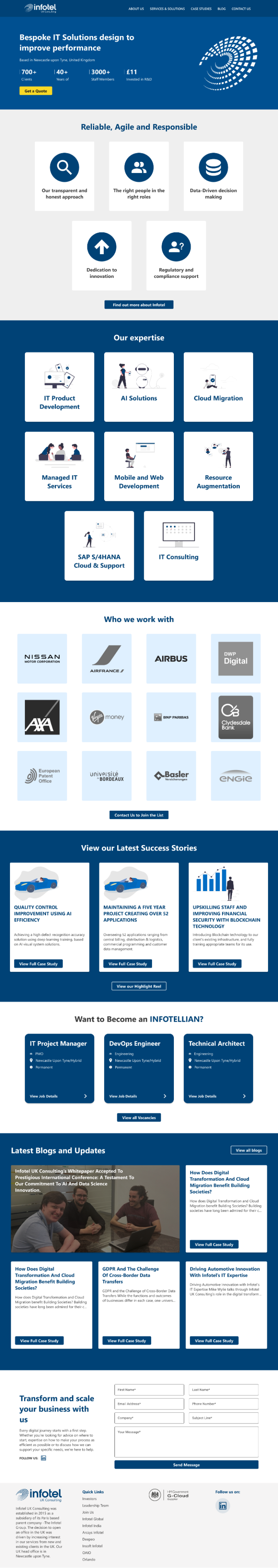
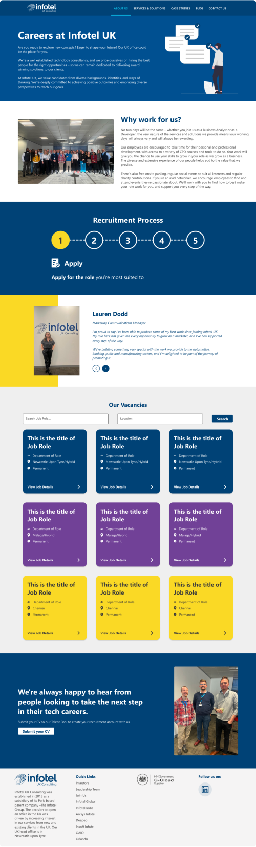
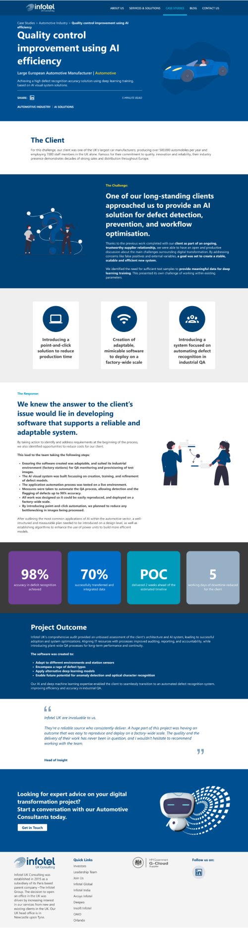
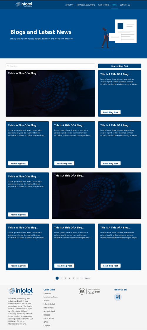
Infotel UK Website Redesign
Following the success of the Infotel Highlight Reel showcase page, I was given the opportunity to completely redesign the public facing company website. The goal was simple, with the aim to be consistent, more accessible and a clear message as to what Infotel is to strengthen the brand of Infotel.

The Challenge
There were many challenges that were to lie ahead when it came to the redesign. All these issues combined meant that the infotel brand wasn't necessarily clear and hard to understand overall: Inconsistency in the usage of colours Inconsistency in the font hierarchy and font families which are used Inconsistent use of imagery, quite often it was obvious images were just picked from a generic stock image site just for the sake of it. Issues with page layout - no logical flow or purpose to it, more just there for the sake of it Next to no consideration for mobile responsiveness
The Solution

The Results...
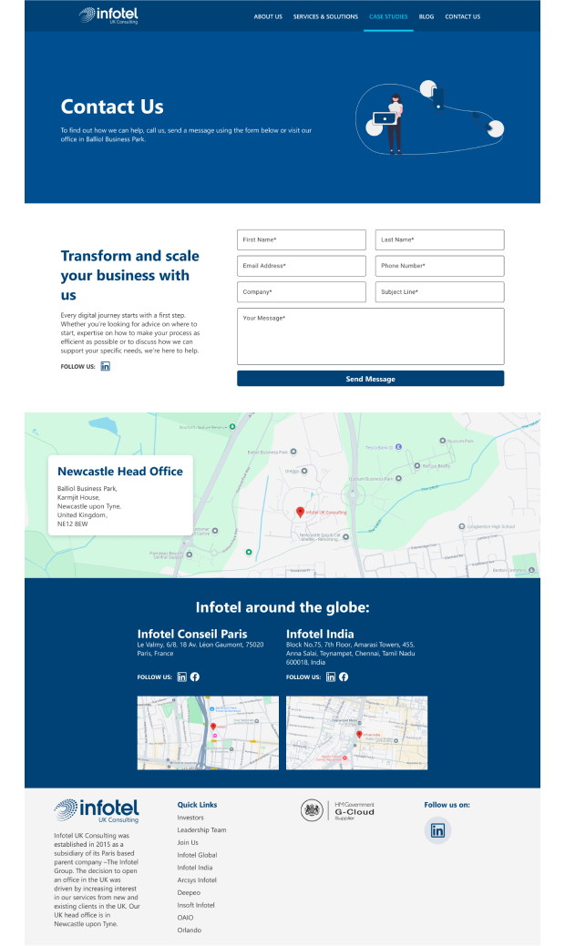
Below is a sample of all completed page examples done as part of the overhaul of the Infotel UK Website. Should you wish to view the site you can do sohere